Planning: Title Design
Title Design
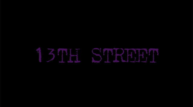
"13th Street"
Context
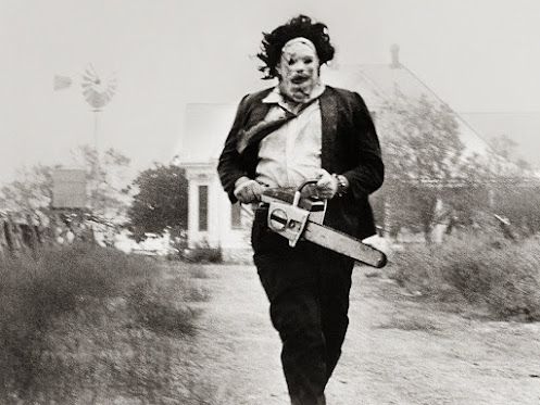
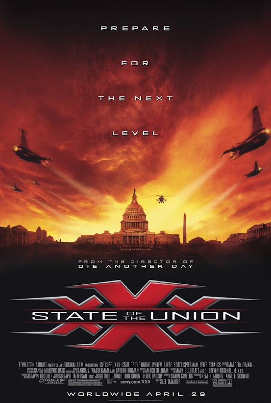
Based on the research I did I want to be able to share a secret message throughout the simple opening sequence. The back story of the film is about a town where there are multiple cases of abduction of young citizens. They all share one thing which is all these abductions happen on the same dark lonely street. That is why I decided to title the film "13th Street". The number 13th over the past decades has been related to bad luck as well as it makes reference to iconic horror movies like "Friday the 13th" among other horror/thriller films.
"13th Street"
More in-depth of the actual design of the title. For the title I aimed for something that shares the message yet it stays intriguing to the audience. I want to avoid the bold fonts that are gothic style which are common in thrillers/horror films. I am into a lot of older styles. Even though the idea of the opening scene is to share an overall of the film and not go into too much specific detail due to the short time we are provided. Yet keeping in mind that the film is an actual real-world problem that authorities attempt to fight if I were to extend it I would definitely include records of the incidents done by authorities. For that reason, I want to use a typewriter font for the title because once again it is something simple yet it can have a significant meaning throughout the film. It is common to see movies have color pallets that are dark as well as red to assimilate the blood yet I want to do something different. I chose purple as the color of the font because it is an uncommon color that can be related to dark/gothic things as well. More or less this will be the color I will be using. Yet it is subject to change the tone to either lighter/darker based on the background. The title design I developed can be found below!


Comments
Post a Comment